


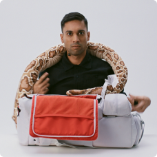
 DS Moto
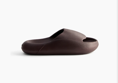
 Sliders
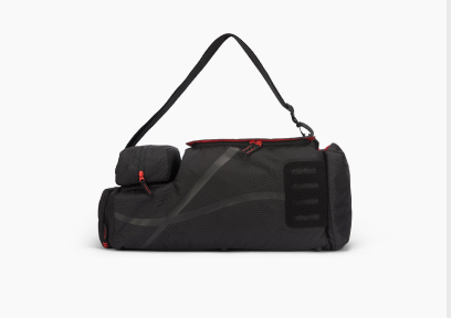
 The Sport Bag
 Socks - Pack of 8


Best colour Combinations for T Shirts That Always Look Great

Choosing the best colour combinations for T-shirts has long been an art form in fashion. For enthusiasts who pay close attention to detail, the right pairing of shades transforms an ordinary tee into a trending T-shirt. The goal may be casual streetwear, smart-casual layering, or standout design; colour plays the deciding role in how your outfit is perceived.
Let us explore proven t-shirt colour combination choices, timeless classics, and contemporary contrasts that consistently deliver strong style. From minimalist two-tone designs to bold high-contrast palettes, these are the combinations that resonate across seasons and trends.

Why Colour Combinations Matter in T-Shirt Styling
The T-shirt is one of the most popular types of T-shirts worldwide. Its versatility comes down to pairing—fabric, fit, and most importantly, colour. Wearing the right t-shirt design colour combination enhances confidence. Colour can soften or sharpen a look, add energy, or bring understated elegance.
Designers and everyday wearers alike know that the best t-shirt colour combinations can even dictate how wearable a piece becomes. For example, muted tones blend seamlessly into workwear, while high-contrast tones command attention in social settings.
Classic T-Shirt colour Combinations
1. Black and White
No list of best colours for t-shirts is complete without the black-and-white pairing. As an official t-shirt colour, black works as the base canvas for prints, while white lends balance and clarity. The black & white combination is versatile enough to work in a two colour combination t-shirt or simple monochrome tees.
It is also one of the strongest answers to the style question: what is the best t-shirt colour combination with black pants?—The answer remains white, as it offers striking contrast with minimal effort.
2. Navy and Grey
Navy brings depth, while grey introduces subtlety. Together, they create a calm, modern aesthetic. Many of the best t-shirt colour combinations for men feature navy due to its adaptability across casual and semi-formal settings. Pair a grey crewneck with navy chinos, or go the reverse with a navy tee layered under a light grey jacket.
3. Red and Black
For those who want bold impact, the red-and-black combination never fails. This duo emphasises strength and energy while staying grounded. A red print on a black tee makes an excellent t-shirt design colour combination, and works especially well with graphic or statement pieces.
4. Olive Green and Beige
Earth tones dominate many collections today. Olive green adds richness, while beige keeps the palette wearable. Among the best t-shirt colour combinations for men, this pairing stands out for its balance. It is also suitable for outdoor-inspired looks, minimal streetwear, and relaxed layering.
5. Blue and White
Blue and white is a combination that feels fresh year-round. From bright sky blue tees with white prints to darker indigo shades balanced with clean white graphics, it is one of the most popular t-shirt colour pairs globally. The combination also integrates well with denim, sneakers, and casual accessories.

Contemporary and Bold Colour Pairings
6. Mustard and Black
The energy of mustard yellow combined with the grounding of black creates a visually striking look. This two-colour combination t-shirt pairing has become a favourite in streetwear for its contrast and modern edge.
7. Purple and Grey
A less common but highly stylish pairing, purple and grey, sits at the intersection of boldness and refinement. A purple base with a subtle grey print—or vice versa. You have an understated yet eye-catching look!
8. Teal and White
Teal offers a vibrant yet sophisticated tone, especially when contrasted with white. The pairing shines in warmer months and works equally well for casual or sporty designs.
9. Orange and Navy
Orange energises, while navy provides structure. Together, they form a standout colour scheme often seen in athletic-inspired tees and retro-style prints. For those exploring t-shirt design colour combination ideas, it is worth experimenting with.
10. Black and Gold
Black paired with metallic gold elevates the T-shirt into statement territory. It works well for official t-shirt colours in team wear or event designs, but also transitions easily into fashion-forward streetwear.
How to Choose the Right Combination
Contrast: High contrast combinations draw immediate attention. Low contrast combinations reflect subtlety and versatility.
Occasion and Mood: Brighter palettes communicate energy and playfulness, while darker tones suggest sophistication and restraint. So, it often comes down to the message you want to convey.
Wardrobe Integration: Ask yourself how your T-shirt will interact with what’s already in your wardrobe. The right t-shirt colour combination with black pants is usually lighter or brighter to offset the depth of the bottoms.
Read - About organic cotton tees
Final Thoughts
The best t-shirt colour combinations are timeless because they balance style, contrast, and wearability. From monochrome staples to bold modern contrasts, experimenting with shades allows enthusiasts to expand their personal expression.
Whether designing for retail, customising prints, or simply elevating your daily rotation, understanding t-shirt colour combinations ensures every outfit feels intentional. With these pairings, your T-shirt choices become an essential part of curating style.
Relate - Check popular t-shirt colours
FAQs
What are the safest t-shirt colours?
Neutral shades like black, white, grey, and navy are reliable choices. They pair well with most outfits and stay relevant across seasons. They also allow easy layering with bolder shades.
Can bright t-shirt colours work for everyday wear?
Yes, bright shades like red, teal, or mustard can work if balanced with neutral pants or jackets. They can add personality without overwhelming your outfit.
Which t-shirt colours look good in photos?
Solid black, white, navy, and earth tones photograph well because they reduce glare and keep focus on the subject. Brighter tones can also work, but pairing them with neutral backgrounds enhances balance.
How do seasonal trends affect colour choices?
Lighter shades such as white, pastels, and sky blue dominate spring and summer. Richer tones like burgundy, olive, and mustard gain attention in autumn and winter, complementing layered outfits and colder-weather textures.
What are the best two colour combination T-shirt ideas?
The best two colour combination T-shirt designs pair contrasting or complementary shades. Popular choices include white & black, navy & grey, red & white, and yellow & navy for a stylish and balanced look.
What are the most popular T-shirt colors?
The most popular T-shirt colors include white, black, navy blue, grey, and red. These versatile shades are favored for their ability to match various outfits and suit different occasions.
Which T-shirts go well with grey pants?
Grey pants pair well with a variety of T-shirt colors. Popular choices include white, black, navy blue, pastel shades, and even bold colors like burgundy or mustard for a stylish and balanced look.


